
Today is the feats day for the Virgin of Guadalupe. Back in 2007 I made this image of Her entirely out of maps from many of the place she watches over. It’s 12”x24”. There are also prints available of this piece on Society 6.

Today is the feats day for the Virgin of Guadalupe. Back in 2007 I made this image of Her entirely out of maps from many of the place she watches over. It’s 12”x24”. There are also prints available of this piece on Society 6.

Over the years, while working on collages, I began to see how using source material from a certain period could “date” a piece. I do not mean to imply that by “dating” a piece it’s somehow out of fashion. But rather I am using the term “dating” in the sense of freezing time. When I use older source material in a contemporary piece, I am creating something akin to a time capsule. So much of the material I use is destined for landfills and recycling bins. When I repurpose the material for a work of art, it in turn also becomes preserved in a way other than the placing it in a drawer or mylar envelope.
A collage can be a way to preserve various ephemera. Even after a little cutting, you are setting the material in some sort of glue for the ages. But when I start cutting, there is usually little of that kind of preservation going on. I tend to work with small pieces — thousands of small pieces. But even after I cut material into little pieces and reconfigure it, what I still do preserve is the color. And color can really change over time. Some shades of a color are very distinct to a certain time.
For example, when you see a distinct shade of a color it can trigger a memory. The color may bring an image to mind or specific point in time. It happens when you see a color like the original blue on a classic car and immediately realize that particular blue was only used on cars during the 1960’s. Memory triggering color may also be associated with clothing, household objects, old photos or printed material. It might be the shade of baby blue or pink that reminds you of a vintage telephone. There are distinctive shades of red and blue that were used as backdrops in advertising photos in the 1950’s. The olive green and harvest gold kitchen appliances of the 1970’s are unmistakable. Dig deep in the closet and something in a very bright yellow or purple (or both) might fall out. It’s probably a shirt that hasn’t seen the light of day since Daddy Bush was president.
As I cut up things like old maps, atlases, vintage postcards and discarded magazines and books my first purpose is just to make a work of art. I work in the present. But, I also understand that I am preserving color palettes that are disappearing.
Some examples of some Palette Preservation can be seen above and much more is at tofuart.com.

How can you not love a big pink dinosaur? I went down to Yerba Buena Center for the Arts to have a second look. This time I took along my neighbors, 4 and 6 years old. They agreed — the dinosaur is cool. The dinosaur is made out of hundreds of recycled pink plastic bottles. The installation is the work of the team of Indian artists Thukral & Tagra. It’s my favorite part of YBCA’s current show The Matter Within: Contemporary Art of India.

It’s time for another show up in Vancouver at the Richmond Art Gallery. Last year it was Artist Trading Cards, this time the theme is mail art. The three 5”x5” mixed media pieces above are from the Trailer Series that was mailed up to Canada
More about the show is below and on the gallery website.
Richmond Art Gallery
7700 Minoru Gate
Richmond BC, V6Y 1R9, Canada
November 18, 2011 – January 15, 2012
Opening Reception: Thursday, November 17, 7–9 pm
Artists from all over the world have contributed their work for the Richmond Art Gallery’s International Mail Art Exhibition and Swap. This exhibition is intended to be a cultural exchange, where artists exhibit their works and receive new works as part of a swap. This shared enterprise is free from the rules of the art market, and yet we asked artists to respond to the theme of “economy” in all its forms.
Mail Art (aka Postal Art) is an art form where artists exchange artworks and correspondence through the mail to one another. The historical roots of Mail Art can be traced back to the artist Ray Johnson and his New York CorresponDANCE School that formed in the 1960s. Based on the principles of barter and equal, one-to-one collaboration between artists, Mail Art has become a worldwide cultural movement for artists to share visual art, poetry, or any other art form through the postal system.


One of the roles an art museum can play is exposing the public to artists and work that they are unfamiliar with. The blockbuster shows with the big names we all recognize serve a different purpose. When the Picassos are packed up and take a trip around the world, it’s an opportunity for everyone who can’t make it to Paris to see famous works of art. At the same time, as an artist, I often find myself truly appreciating a museum when I get exposed to something completely new to me. Yesterday I went to the de Young and saw a show of work from the photographer Ralph Eugene Meatyard. It is a good example of why I visit museums.
Meatyard died young n 1972 and his work has remained somewhat obscure. The show at the de Young has over 50 photographs and is titled Dolls and Masks. He staged his photos. Many contain dolls and the models often wear masks. He usually used his wife and children as models for the masks. The photos are typically set in overgrown gardens and ramshackle, decaying buildings. If one was to classify his work, the term Southern Gothic immediately comes to mind. Some of the photos feel as if they are meant to illustrate the works of writers like Carson McCullers or James Purdy.
Dark images of broken dolls and rubber masks on children could be a recipe for a disturbing body of work. At first glance, the first word that comes to mind is creepy. But that reaction quickly evaporates as you look closer at the work. Perhaps because he worked with his own family, there is something innocent about Meatyard’s work. It’s hard for me to express why, but this work comes off as oddly pleasant. On the other hand, I can imagine if Meatyard’s contemporary Diane Arbus had come down to Kentucky. If she taken photos of the same subjects. I am certain I would have had that uncomfortable reaction I usually do to her work.
Even though I just discovered Meatyard yesterday, I keep going back to this photo I took a few years ago. It's of an abandoned doll down the street from my apartment. That day I may have been channeling. The Meatyard show runs until February 2012 and it’s one I need to see a few more times.


Superstition & Exquisite Corpse is the show I am in this month at the Tangent Gallery in Sacramento. I have the piece called "Don't Step on the Cracks" in the show. It's a 12"x12", mixed media photo collage (see above).
Tangent Gallery is at 2900 Franklin Blvd. in Sacramento. The opening reception is Saturday, October 8 from 6-10 p.m. The gallery is open Saturday's 12-3 (or by appointment).

This weekend is one of San Francisco’s better art weekends. It is time for the annual Alternative Press Expo (A.P.E) in San Francisco. A.P.E. gets bigger every year and might be reaching the point where it is too big. It’s filling most of the Course Exhibition Center now.
I always get some new art at A.P.E. and it’s good opportunity to meet the artists too. Officially A.P.E. is am alternative comics and graphic novels shoe. But the event would be better described as being a show for artists who do alternative comics and graphic novels with an emphasis on the art and artists.
I found quite a few things that I like including some of the artists listed below:
A.P.E. is all weekend and if you haven’t had your fill of art, open studios begins this weekend as well. If you’re finding this blog after the fact, go to A.P.E.’s website and be sure to mark your calendar for 2012.

Fulton Street - Sunday Streets - September 11, 2011
I have to confess that I had a lack of enthusiasm for Sunday Streets when it started back in 2008. I kind of assumed it was just another street festival. San Francisco loves its street festivals. You can find one happening just about every weekend for nearly six months of the year. And while they vary by theme and neighborhood, they all begin to feel the same after 20 years. Actually, that was my reaction after living five years in San Francisco.
Sunday Streets is a very different thing altogether. With Sunday Streets you get a whole piece of a neighborhood closed-off to traffic. Usually about 20 blocks are emptied. Street Festivals are much more compact and usually very crowded. It’s a different energy at Sunday Streets. While there are small crowds of activity at different spots, there is none of that get-me-out-of-here feeling most crowds give me.
A few friends have asked me “What’s there to do?” It’s hard to answer. It’s more just about hanging out and enjoying the space. Running into friends and neighbors. There are tables here and there from different community groups and there are some fun activities for kids. There is some music and dancing. But unlike the street festivals, the bands that choose to play, might find their biggest crowds come from toddlers. Yesterday, across from the police station on Fillmore Street a band called Rin Tin Tiger was playing (good band name). Their Facebook Page indicates they often get hassled by the police for playing on the street. It was nice to see them getting to perform without trouble across from the station. It’s kind of the essence of what Sunday Streets is all about — repurposing the streets for play.
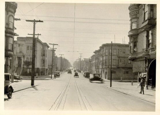
If you have ever perused the library’s historic photo collection, one thing you quickly notice is how empty the San Francisco’s streets used to be. I live on a busy street with three lanes of traffic. It’s one of San Francisco’s one-way, “freeway” streets. Photos of the street from the 1920’s show a street with plenty of parking spaces and few cars. Could the City of the past be the City of the future? Not that I see Sunday Streets as being anti-car — it’s more about showing us an alternative. Streets without cars.
The removal of cars and emptying of streets for other purposes, even occasionally, transforms the space. San Francisco has many people who feel they are quite clever heading up to the Nevada desert and installing an urban space called Burning Man every year. For me, the real act of art is creating open space out of urban streets.


The annual Zine Fest that happens in San Francisco is becoming an event that is getting a permanent spot on my calendar. It’s growing, yet is still small enough to feel accessible and manageable. I am not a fan of massive events. Labor Day Weekend is one of my favorites in San Francisco. It feels like half the City is at Burning Man. The rest of us have the place to ourselves and get to have this really cool event.
There were some familiar artists at this year’s Zine Fest but quite a few I had not seen before. Some of the highlights of this year’s event include:
